Creating the menu items / Front-end layouts
Introduction
After ceating the Custom Products and their Groups its time to create the appropriate menu items to display the product builder layouts to the Front-end.
Product Builder comes with 7 different layouts. Each menu item type represents a different layout.
There are 6 layouts for displaying and customizing a custom product and one for displaying a list with the exitsing custom products (Custom Products Browse Page).
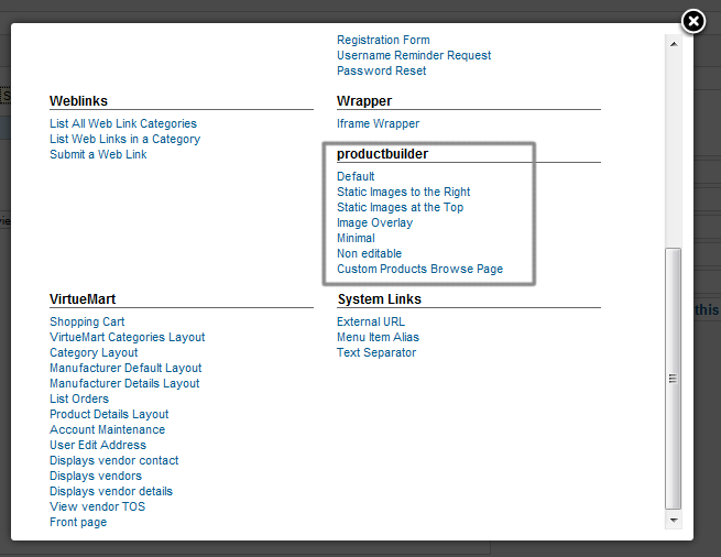
Some info about the layouts.
1. Default : It displays information (Image,Short Description, Manufacturer) about a selected product of a group after the user selects a product.
2. Static Images to the Right : After every selection in a group it displays the image of the selected product at the right of each group.
3. Static Images at the Top : It displays the images of all the selected products at the top of the layout.
4. Image Overlay : The images of the selected products are overlaid one above the other. This way you can use transparent png images to generate the final image of a product which consists of layers. e.g. A t-shirt that consists of the t-shirt and the stamp. If you use that layout, you should make sure that your product images have the same dimensions and fit well one above the other.
5. Minimal : It just displays the product groups without displaying more info about a selected product in a group.
6. Non-editable : This layout displays only groups that have default products assigned. The user cannot change the default product of the groups. It is usefull for displaying product bundles that can be purchased with one click.
7. Custom Products Browse Page : Displays a list of the existing Custom Products. You can set it to display all or specific Custom Products.
Menu Items Settings
The menu items come with a series of settings. The menu items settings are overwriting the settings of the Product Builder component.
Lets see some of those settings.
Required Settings
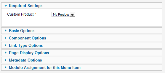
Here you have to select the Custom Product you intent to display in that layout. This setting is mandatory so you have to select a Custom Product from the list.
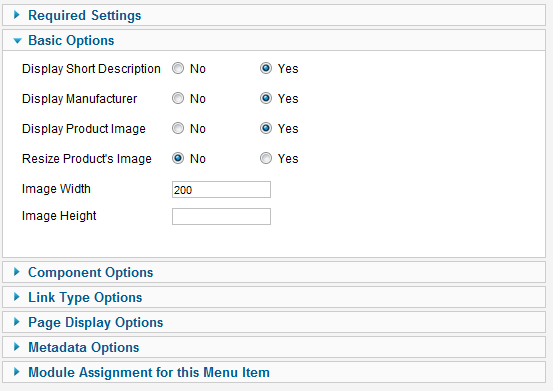
Basic Options
Consists of some options that concern this layout. Every type of layout has different features, so you have to set which of those features and how you want to use them.
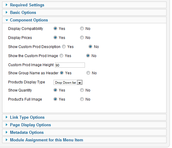
Component Options
Here there are some of those settings that exist also in the Product Builder Component's settings. As these settings are overwriting the component's settings you have to check them carefully. They regard some important issues such as the price display, the compatibility button display the group display type and others.
Steps/Pages
Using the steps you can split the groups display to different pages. This way the user experience can become much better and less tiring.
Here is how it works:

You have to press the "New Step" button wherever you want to add a page break. This will split your groups at that point and create a new step. Using the title inputs (below the groups) you can set the titles of each step.